The current League of Legends client is showing signs of serious degradation with more and more bugs appearing constantly and Riot Games is forced to find a solution to fix the small but extremely annoying bugs on the current Client.
The shop in particular and the common Client of League of Legends often encounter small errors that make gamers extremely uncomfortable. For example, the process of loading RP into the account, after entering the store, it still shows that you do not have enough RP to buy items but have to exit the store to re-enter. Even if it’s just a small thing, but for players who put utilities first, it’s hard to accept.

That’s why Riot Games started the League of Legends client upgrade campaign, starting with the store interface, when randomly selecting a few accounts to test the new interface. A gamer was surprised when his friend was among those few and posted these new images on the Reddit forum.
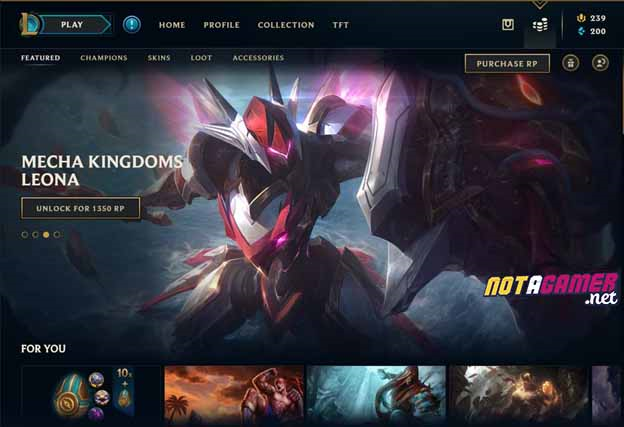
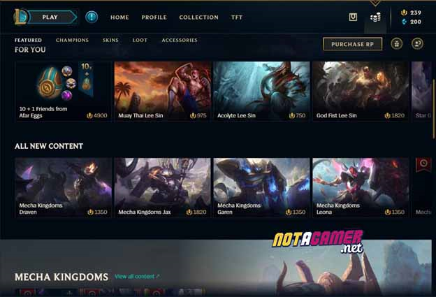
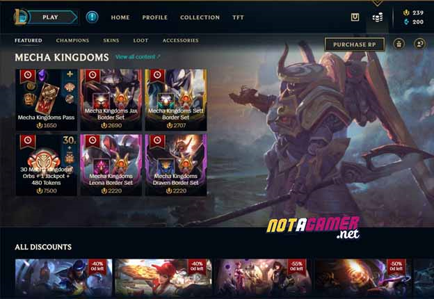
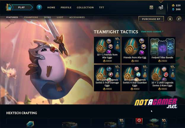
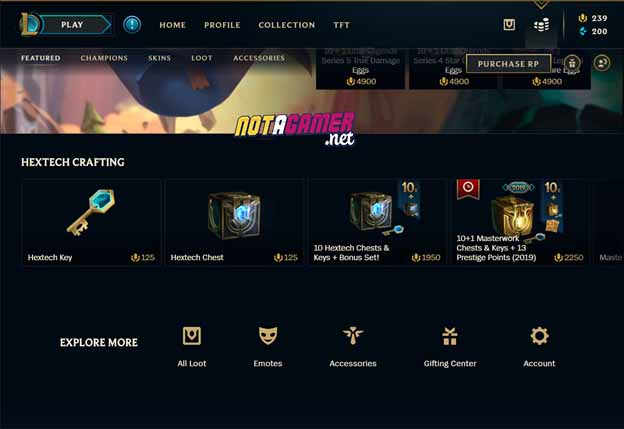
According to many opinions shared, this is an A / B Testing version of Riot Games, by having two groups of players test two different “versions” of the store interface and receive feedback from the player pool, they will find out the most appropriate ways to change the interface of the League of Legends Shop.
According to a comment in the Reddit post, the plan of Riot Games will be to test a few different interfaces on a few accounts, if it performs well (selling more costumes, items than usual. ) will be considered for the official launch. Some people have found that the new store will be “smarter” when the items introduced on the homepage will coincide with the champion that the player uses a lot, for example in the picture above is a lot of Lee Sin’s skin be PR.
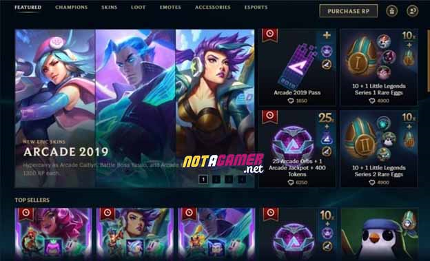
It can be said that this is the first move in upgrading the client of League of Legends, which has been degraded quite a lot recently. Hopefully this new, somewhat more beautiful and “smart” interface will soon land on the official server.
Do you think the new interface is beautiful? Does it bring clarity and eye-catching for player? If it were you, would you choose an old or new interface? Please leave your opinion below the comment section!


You must log in to post a comment.