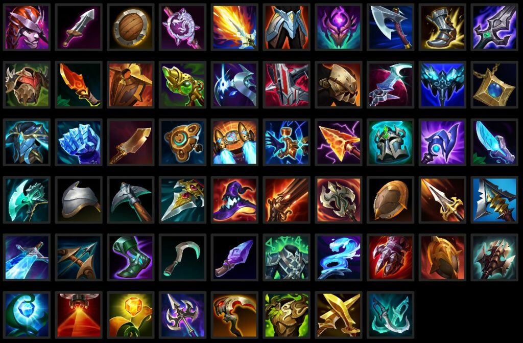
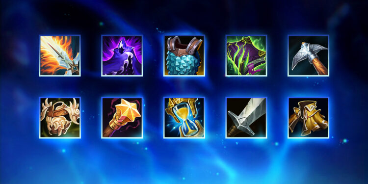
A lot of players were complaining about the visual clarity of the items.
For certain facets of the game, changes often occur during the League of Legends preseason as players adapt to the new systems that have been put in place. However, the group recently expressed several complaints about the new look of all the item icons.
Fortunately, Riot Games is listening closely to the player base’s feedback and is making some much-required improvements to improve the clarity of various items in the shop and inventory for everyone attempting to differentiate it.
When the first iteration of new items arrived on the live servers, many people found it was difficult to distinguish between the items for many reasons, including the number of information that crowded the design. Others also said that the new designs were not visually distinct, but more so to look pretty. The new effects do not translate that well into the shop and inventory, which makes it more difficult to quickly identify items.
As a result, Riot will make some adjustments to the icons. The devs will focus on the item silhouette, while also reducing the amount of “noise” surrounding the item itself. There will also be a greater color distinction between items so that players are not confused by two or more items due to appearance. The polish applied to several items is also addressed in the upcoming patch.

These fixes are aimed to remedy all of the issues the players have had since the first few days of the preseason. Colorblind players, for instance, have had an extremely difficult time identifying items due to color and design choices. This first batch of changes could mitigate these issues during the rest of the preseason.


You must log in to post a comment.